Saturday, December 30, 2006

When Is TV Not TV? (When It's IPTV!)

In order to get its proposed merger with Bell South approved by the FCC, AT&T has agreed to abide by Net Neutrality at least for its DSL service. Initial reaction to this was largely positive echoing the conclusion of Tim Wu:

What is clear is that this agreement marks a critical moment in the recent history of Network Neutrality and big step forward for its supporters.

Unfortunately what isn't covered in the agreement -- in fact, it's specifically ruled out -- is AT&T's next generation internet service called "Internet Protocol television", or 'IPTV', for short.

This exception apparently doesn't faze Wu who, listening to the Siren Call of "TV", dismisses it thus:

These [IPTV] services are IP in name only. They are in practice and architecture a direct competitor to cable television services. These services use only the private infrastructure built by AT&T, and do not rely on the public Internet as described by IP addresses. Hence the exclusion of private IPTV services should be considered less controversial.

So the new service is just like Cable TV! Nothing to worry about!

Susan Crawford on the other hand, will have none of this. In a post titled, "The Day the Internet Became Cable Television", she lambasts the agreement:

AT&T is effectively saying, "We'll keep existing 'broadband' access neutral. But when it comes to our new super-duper 'AT&T Yahoo! High Speed Internet U-verse Enabled,' well, that's not up for negotiation. We need to make money there. 'Enabled' and 'broadband' are not the same thing."

She points to a press-release announcing AT&T's new 'U-verse' service. It describes three levels or "packages" to choose from:

  • Elite: Downstream up to 6.0 Mbps, upstream up to 1.0 Mbps.
  • Pro: Downstream up to 3.0 Mbps, upstream up to 1.0 Mbps.
  • Express: Downstream up to 1.5 Mbps, upstream up to 1.0 Mbps.

Even Guglielmo Marconi could tell you this isn't "TV". With "TV", you don't need an "upstream". The TV station simply dishes it out and you sit there and take it in. That's TV!

You only need upstream, when you want to build feedback into the system -- when you want to make it "interactive" -- sort of like we now have using... DSL.

So the moral of the story is, the moment they start talking about "TV", ask them if they're building any interactivity into it. And if they say yes, ask them how it's any different from what we have now. Just making it faster and slapping a new name on it doesn't make it different.

Tuesday, December 26, 2006

U.S. Military: HTML Email Is a Security Threat

The Department of Defense is automatically converting all formatted email (aka 'html' email) to plain text:

The [Joint Task Force for Global Network Operations] mandated use of plain text e-mail because HTML messages pose a threat to DOD because HTML text can be infected with spyware and, in some cases, executable code that could enable intruders to gain access to DOD networks, the JTF-GNO spokesman said.

Attachments like Powerpoint "used for briefings" can still get through. Article here... (h/t ZDNet)

Monday, December 25, 2006

All Things Ruby on Rails

Justin Williams has a good primer on Ruby on Rails (AKA 'RoR') called 'Ruby on Rails for the Rest of Us'. RoR is a "rapid development framework" for creating online applications. It's generated a lot of interest recently because it's a handy way to develop database-driven sites.

(I was surprised to find out that Twitter of all things runs on it.)

In any case, the article also provides a number of links for further information including the main RoR site, rubyonrails.com

For a taste of Ruby, the programming language that RoR is built on, have a look at 'Try Ruby!'

Sunday, December 24, 2006

Social Networking Awards from Mashable.com

Having trouble keeping track of all those new social networking services? Well, Mashable.com has put together a handy guide as part of their "2006 Social Networking Awards".

The list reads like a Who's Who of social networking services with everyone from MySpace and YouTube to Flickr and Digg having made the grade. There are also popular picks ("people's choice") and best bets for the coming year.

Thursday, December 21, 2006

Adobe Icon Controversy

Nothing like a graphic design controversy to brighten up the day!

If you look at the Mac taskbar above and can figure out the difference between 'Lr', 'Ps', 'Ai' and 'Id', maybe you'll have no problems with the application icons in Adobe's new Creative Suite 3 currently in Beta.

For many designers however it's been thumbs-down.

Dave Shea has a wonderful analysis of the icons called 'Icont'. His reasoning reads like a basic lesson in graphic design:

They fail because there is no shape variation. Every icon is contained within an identical square. Nothing breaks the silhouette, the only shape variation occurs inside the square, in the form of the letters. But using a common typeface, stroke weight, and posture across every icon means the various letters have more in common with each other than they differ, and at a glance they all blend together. Since this is the sole shape differentiator, it’s a big, big problem.

Comments by designer Jason Santa Maria also merit a read.

I guess for me the bottom line is, the icons are pretty generic and drab. I'm not a great fan of the current icons but frankly, when I saw a shot of them all together, I had abolutely no idea what they were for. They looked like a bunch of Color Samples for choosing a bucket of paint.

You'd think Adobe could do better.

Wednesday, December 20, 2006

Monday, December 18, 2006

Usability Report on ALA's Website

I find usability reports fascinating. I went through the ALA's "Usability Assessement Report" and my favorite part was "Appendix F – Usability Testing Notes".

But the entire report is worth a read. The people who put it together did a good job. I mean, who can argue with a recommendation like this:

Organize information according to content. Except for the information specifically about ALA or the divisions, do not categorize the information — especially information of interest to the general public — according to ALA’s organizational structure....

What quibbles I have are minor. That said...

"Meaningful" URLs?

The report recommends that URLs should be "meaningful and reasonably short" (p.13). While I'm all for "reasonably short", I think trying to make them "meaningful" as well is hoping for too much.

Sure there are obvious examples of meaningful URLs that have become almost standard: '../about' for 'About Us' and '../contact' for 'Contact Us'. On a site like ALA.org, you might also expect '../divisions', '../publications', etc. But you can only take this so far.

Even the example they use in the report, "Prods_Pubs" for "Products_and_Publications", doesn't seem particularly intuitive or meaningful to me. I think for most of the pages, just being "short" as in 'ala.org?p=123456' is about as much as we can hope for.

No Division Acronyms for Navigation?

The report argues against using division acronyms like 'ACRL' or 'PLA' as part of the navigation. I don't see why not.

As someone who's paid annual fees for a couple of these Divisions down through the years, the acronym is just about the only thing (other than the location of the annual convention) that I know about ALA. If new people are having trouble deciphering these acronyms, maybe it's an indication that the landing page for the Division Section isn't all that findable.

One way or another, I'm not sure a navigation scheme based on their full names would be any better. It certainly would be a whole lot more crowded.

Butt Ugly Site!

Okay, I said these things were minor. But only in a few places is there even an intimation that the visuals suck.

About the closest you get is in this user comment:

"The website design ... is extremely unprofessional in appearance. It's like it was designed back in the 1990s before librarians were so internet-savvy, and no one has bothered to update it since then." (p.10)

The color scheme is unattractive. Graphics aren't used in a particularly optimal way to enhance text and navigation. And of course the thing looks like it came out of the 1990s: There's absolutely no use of layout or typography beyond the most basic "three column display"; Everything is just one "river" (or "flood") of content; And the content itself is nothing more than '<h1><p><p><p>', rinse and repeat.

They're going to have to get a whole lot more sophisticated than that to break out of the 90's look.

I'm confident they will. There's no reason why a site that represents the ALA can't be a bit more user-friendly -- and appealing to the eye. (h/t Shifted Librarian)

Podcast of Alan Cooper

Alan Cooper is the author of two absolute classic books: "The Inmates Are Running the Asylum" and "About Face 2.0: The Essentials of Interaction Design".

In this podcast by Gerry Gaffney, Cooper talks about personas, interaction design and other aspects of User Centered Design (UCD).

Interesting quotes include:

"Personas are not something we make, they're something we discover."

Appropriate focus:

"Even though you have a broad constituency of users, you should have a narrow selection of goals. By definition, a product serves a narrow spectrum of goals, even if it serves a broad spectrum of demographic."

Difference between 'marketing segmentation' and interaction design:

What Interaction Design does is, we go directly to that motivation -- not why someone would to buy but why someone would be satisfied using. That's a deeper thing.

Listen to the whole thing here... (h/t infoDesign!)

Sunday, December 17, 2006

Book: 'Getting Real' by 37signals


This came out in March but it's still worth a mention -- particularly in the context of the "Kuckoo for Features" approach discussed here earlier.

It's a book called 'Getting Real', written by Chicago-based web development firm 37signals. It applies a provocative 'take-no-prisoners' approach to software development: Cut out the fat, narrow your focus, keep it as simple as possible.

The entire book is available online. It's pretty brief and worth a read. One of my favorite lines: "More isn't the answer. Sometimes the biggest favor you can do for customers is to leave something out."

Time Person of the Year: 6,965,000 Pieces of Mylar

That's a lot of Mylar:
The 2006 Person of the Year issue—the largest one Time has ever printed—marks the first time we've put reflective Mylar on the cover. When we found a supplier in Minnesota, we made the company sign a confidentiality agreement before placing an order for 6,965,000 pieces. That's a lot of Mylar.

Thursday, December 14, 2006

Self-Publishing at $7 a Pop

We're so focused on Digital Libraries and other forms of online communication that we often overlook how profoundly the Web has changed the delivery of ordinary goods and services.

We've had self-publishing (sometimes called "vanity publishing") since the dawn of printing. But it's only recently that we could upload the information and within a certain amount of time, receive a finished work in the mail as good as from any publisher.

But here's the real significance, beyond the convenience, the technology has brought down the cost to where a B&W work might cost no more than $7 a copy and full-color works no more than $60!

Kevin Kelly goes over two online services, Lulu and Blurb, on his Blog 'Cool Tools'. If you've got a manuscript at the bottom of your desk drawer, now's the time to pull it out and get the thing into print! Read more here... (h/t xBlog)

Tuesday, December 12, 2006

Browser War Redux

I spose I'm showing my age by using 'Redux' instead of '2.0' but, boys and girls, I remember the first round of browser wars as if it were yesterday!

Essentially Internet Explorer booted Netscape off the face of the planet not because of any particular advantage it had over the competition but simply because it was part of the Windows OS and lock-in trumped all.

Well, since then, Microsoft has sat on the thing (so much for 'Freedom to Innovate') while an offshoot of Netscape, Mozilla, refined its own product, the open-source FireFox. Now finally MS has woken up and released IE7.

So it's the IE-Firefox Browser War all over again. But, but, argues Read/WriteWeb, what this really is is a proxy war between Microsoft and (who else?) Google with nothing less than the "multi-billion dollar advertising industry" at stake. How so, you ask? Well, read the rest of the post...

Monday, December 11, 2006

The Gift to Be Simple

shaker bench

It had to happen.

First there was the period of experimentation on the Web. Websites were meant to be "explored" we were told -- even the more mundane ones. When that didn't seem to work out, the pendulum swung the other way in favor of clean and simple design. The search screen of Google comes to mind.

Now the question is, are we experiencing a backlash to the backlash?

First, there's the article by noted design theorist Don Norman entitled, 'Simplicity Is Highly Overrated', which concludes:

Yes, we want simplicity, but we don’t want to give up any of those cool features. Simplicity is highly overrated.

Next we have Joel on Software arguing that simplicity "will not work as a good long term strategy". I'm reminded of the librarian discussing his new website who said users only understood the search box on every page when there were three search boxes to choose from.

Don Norman asks us rhetorically,

"Haven’t you ever compared two products side by side, comparing the features of each, preferring the one that did more? Why shame on you, you are behaving, well, behaving like a normal person.

I admit it. I'm looking for a phone at the moment that does everything but light up the driveway when I get home. I love features as much as the next guy.

But it's important to realize a simple fact: people want the features but they don't want the complexity. Furthermore, they'll prove extremely reluctant to try out a site, if in order to accomplish their goals they've got to master every feature on the thing. If this weren't the case, 'Advance Search' would be the first stop of even our most neophyte users.

FireBug : Geek Tool of the Month

FireBug logo

Here's something that just made the life of anyone involved with CSS or Javascript a whole lot easier. FireBug is an "extention" for the Firefox Browser that allows you to see the CSS of a web page and change it in real-time.

The Webdeveloper extention does some of this, but FireBug is far more elaborate and hence more helpful. The Screencast explaining the features talks about FireBug being a help for remembering your own CSS. That's true but I can also imagine it being extremely helpful when trying to figure out a website or template originally done by someone else. In any case, it's a great product for thems that need it. You can download it here... (h/t mezzoblue)

Sunday, December 10, 2006

ChillingEffects.org

While googling for pictures of failed technologies for my post on eBooks, I came across a strange note at the bottom of Google's search results. It read:

"In response to a complaint we received under the US Digital Millennium Copyright Act, we have removed 2 result(s) from this page. If you wish, you may read the DMCA complaint that caused the removal(s) at ChillingEffects.org."

eBooks are from the Department of Bad Ideas

Sony iPad

Someone asked about eBooks on one of the library lists I'm on. They wanted to know what the prospects were. I responded on the list but I thought I'd share my opinion here as well.

I've never really understood the rationale behind these devices. I mean, I already have something that reads "electronic books" -- it's called a laptop. If I wanted something even more mobile, I'd get a smaller laptop -- or maybe use my PDA. The advantages of using my laptop -- besides the fact that I already own it -- is that I can play most formats on it, and not just one.

Furthermore, my laptop can do more than just "read" the thing -- I can cut out parts, re-use it, send it to friends and colleagues. I can link to the file, 'digg it', list it on del.icio.us. In other words, I can do everything I've become accustomed to do on a computer in a networked environment. Why would I want something that could do anything less?

I think if the sole purpose of a device is simply to serve as a platform for a proprietary format, it's doomed. This kind of "lock-in" is not popular with consumers. Just ask Sony how its own version of the iPod is doing.

Hallmark of Failed Technology: Sony Memory Stick Walkman (NW-MS7)

Sony launched this unit amid much fanfare and expectations on the auspicious occasion of the 20th anniversary of the Walkman. Forget the iPod, which didn't even exist at this point, this player was supposed to be the successor to the fabled Walkman. Unfortunately because it only played Sony's proprietary format and showed more innovation in Digital Rights Management than Features for the users, it never got off the ground.

Sony showed it hadn't learned anything when four years later it released the Network Walkman NW-HD1, its 'iPod Killer' that also failed to gain any market acceptance.

Friday, December 08, 2006

Domain Registration While Drunk

Friends don't let friends register domain names while drunk. Unfortunately, no one was there to stop Robert Scoble. He went ahead and did it. Now he's the proud owner of 'somethingfuzzy.com'.

In the same spirit of candor, I confess to the following transgressions:

  • Draft-Al-Gore-2008.com
  • DemocraticBarfly.com (+ .org, .net & .us!)

Thursday, December 07, 2006

Zillow Has A Wiki

Zillow.com logo

It's always interesting to see how other organizations apply technology. It can often be a source of ideas. Here's an example of the popular real estate site, Zillow, deploying a Wiki. (h/t TechCrunch)

Tuesday, December 05, 2006

Monday, December 04, 2006

Wonderful World of Widgets

Widgets (also called 'badges') are like small windows of information about you and your institution that people can put on their own sites.

The information can be about anything: events, news, hours of operation -- anything that you can pull from a database and list on people's sites so long as they embed the pieces of your code in their HTML.

The Widget featured here (actually a screenshot) comes from a company called "ChipIn". It shows a realtime progress bar for a fundrasing campaign along with a link for site visitors to donate or "ChipIn!" themselves. Anyone can go to ChipIn and create one of these things. Up to $9,999 in contributions and there's no fee. Payments are handled through PayPal. (More on Widgetbox...)

Sunday, December 03, 2006

Is Library Culture an Obstacle to Change?

When harshly criticized for the huge disconnect between his words and actions, Charles II defended himself by saying that the actions were his ministers's and that only the words were his own.

I was reminded of that quote when reading "Disconnects Between Library Culture and Millennial Generation Values" by Robert H. McDonald and Chuck Thomas" (Educause Quarterly, 23:4). The authors harshly criticize research libraries for not meeting the needs of their users due in part to a rigid adherence to "old values". This in turn leads to "fundamental disconnects" between libraries and their users in the areas of "technology, policy, and unexploited opportunities".

Saturday, December 02, 2006

Site of the Month: Queens Borough Public Library

QueensLibrary.org - Continue to Complete Review...

The Queens Borough Library Website is so good that it made me want to do this review. It practically cried out for it. The developers have done a fantastic job. They've taken features we routinely find on other sites -- features like creating accounts, specifying preferences and grouping information -- and applied them to a library context.

In so doing, they've upped the standard of what a library website can do -- and what the public can expect from one. They've also provided a good model for other libraries to follow.

OVERALL DESIGN AND LOOK-AND-FEEL

This is a bright, colorful, well-designed site. The overall presentation is busy without being cluttered. Everything has its place. Even the foreign language options -- all six of them -- are comfortably parked near the top of the page.

Top Navigation

Also near the top are two items, 'My Account" and "My Queens Library" that work very much like people have come to expect on other sites. They're built into the system and not part of some vendor-provided separate utility. More on these later.

The navigation is clean, easy to use and robust. Materials are listed on the tabs on top while all other information including user-groups and services is on the left. This left navigation expands and contracts revealing subcategories in an easy-to-use, consistent manner. Running along the bottom is more "institutional" information such as "About Us", "Contact Us", etc.

DYNAMIC, INTEGRATED INFORMATION AND SERVICES

Probably the most noticeable aspect of the site once we get beyond the graphics and layout, is just how dynamic and integrated the information is. We don't have separate applications running various aspects of the site -- one system for web pages and another for events. Rather they're integrated into a common interface and can be arranged in any number of powerful ways.

How branch library information is presented is just one example.

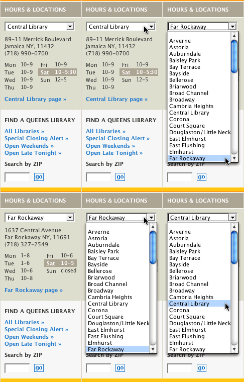
Branch selector

Most large metropolitan areas have branch libraries. So how the information about them is presented and accessed is an important consideration. At the Queens Borough Library site, you select a branch from a dropdown menu that's part of the left navigation. Once you've done this, the information below the menu immediately changes to that particular branch's hours and location -- and the system remembers your selection as you move from page to page! There's also a link for more extensive information about the branch below the hours and location.

But what if you don't know which branch to pick? In that case, you can search for one using a map or zip code. A particularly nice touch is the "Open Late Tonight" link which lists all branches open late according to what day it is. A feature like this would be unthinkable in the days of hand-coded library websites.

We've come a long way, baby!

Even more impressive is how events are handled. The function is completely integrated into the site. You can look events up by date, branch or user group. Each branch has its own calendar which is a subset of the larger institution-wide calendar. Once you've found an event to your liking, you can add it to your "My Events" list and sign up for weekly email reminders listing the events you've selected.

Presto!

PERSONALIZATION

The "My Events" feature is just one example of personalization. The first thing you notice about it is how easy it is to set up. It's just like setting up an account at just about any other website on the face of the planet. You don't need to come from Queens or even have a Queens Borough Library card!

You just enter your username, password and email and that's it. From there, you can begin making your own list of events, designate your "home" branch library and do a number of other things that on other library sites -- if at all possible -- might require pulling out ye olde library card and typing in a long string of numbers.

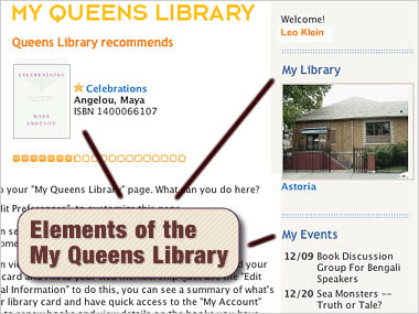
Elements of the 'My Queens Library'

Of course, you'll eventually need to enter those numbers if you want to take advantage of borrower services, including remote use of subscription databases, but the first step is entirely painless. What's more, once you've set up the preliminary account, called a "Web Membership', you can link it to your library card number.

Also well integrated into the site are suggested reading lists on about a dozen different topics (e.g. Biography, Fiction). Each topic has its own newsletter which people can subscribe to online. The library also offers various other forms of recommended materials (music, movies, etc.) all of which link directly to holding information in the OPAC. Bookmarks for this kind of material would be a logical future extension.

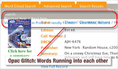
Integration with the OPAC itself is a bit quirky. At least on my copy of Firefox 1.5 running on Mac OS X, text and navigation near the top of each record was smooshed together.

OPAC Glitch

Nevertheless, the initial search box that figures so prominently on each and every page managed to pass my "Treasure Island" test: type "Treasure Island" in the search box and hope that a book by that name actually turns up on the first page of results (not always a given, believe me).

Design-wise, the OPAC carries over the color scheme and navigation of the site as a whole. That's important. No reason to step into an entirely different interface just because the function, in this case finding books and other materials, has changed.

BUGS? COMPLAINTS?

And yes, there are bugs. On occasion, I'd clicked on a link and this caused a database exception of one kind or another (read: ugly error page). The whole system looks like it was homebuilt and that's a good thing because all the pieces work in an amazing way, but on occasion there are loose strings that need to be fixed.

Besides that, there's not much to gripe about -- other than the aforementioned minor formatting glitches due to OPAC integration.

CONCLUSION

In the early days, you'd look at a library website and wonder exactly want kind of ramshackle organization put it together. The sites in no way reflected the role, oftentimes enormous, that the institution actually played in the community.

This is no longer the case. Increasingly we're getting websites that compare favorably with the competition at every level be it graphic design or functionality. The Queens Borough Library web site is an excellent example of this. We don't have to be first on the block with every new feature but it makes sense eventually to incorporate good ideas when we can.

Friday, December 01, 2006

Slightly Less Than Mature Reaction to Inclement Weather in Chicago

 Yippie! It's Snowing!!! (For more shots, check out the Flickr feed...)

US GAO Report: No Competition in ISPs

 GAO Seal

Competition in the area of Internet Service Providers? Fugeddaboutit!

That's basically the conclusion of the Government Accountability Office (GAO) in its new report entitled, "FCC Needs to Improve Its Ability to Monitor and Determine the Extent of Competition in Dedicated Access Services".

Drupal 5.0 Beta

I've been doodling around with the latest beta of Drupal 5.0.

I was thinking of implementing it here [on earlier website] but it's just not far enough along for me to use. Also, most of the modules, which are the true glory of Drupal, haven't been updated yet. (This site's running 4.7.)

Wednesday, November 29, 2006

Hello World

Welcome to my blog!

This is the personal/professional blog of Leo Robert Klein, writer, designer and web developer living in the great city of Chicago.

I'm also a Librarian -- hence the name of the blog*.

This will be where I set down my thoughts on webdesign, librarianship, developments in technology -- and whatever else strikes my fancy. "Gott und die Welt" as the Germans say.

So sit down and make yourself comfortable. It's going to be one hell of a ride.

----------------------

* Note: original posting was on chicagolibrarian.org

Friday, August 25, 2006

Carson's to Close Its Store in Downtown Chicago

This is sad: Carson Pirie Scott will be closing its downtown Chicago store as of March 2007. I used to work there in the Credit Department while going to college. I guess we won't be hearing 'You Get a Charge from a Carson Pirie Scott Charge Card' anytime soon. I remember when they tore down the horrifying 50's or 60's cement facade revealing the original Sullivan finery underneath -- that was at some point in the 70's. They once had a "Roman Day" sale where they repainted the whole sidewalk to look like a Roman Villa together with busts of Roman Citizens on pedestals alongside every shop window. It was pretty wild.