Tuesday, January 30, 2007

End-User Manifesto

gapingvoid posts an interesting list called the "End-User Manifesto". It's billed as "things that need to be in the mind of anyone building software, particularly for the Web." Here are the first four items:

1. Don't waste my time.

2. Help me do the right thing.

3. Respect my decisions.

4. Design well, and guide me to make the right decisions by that design.

They're all really quite good. To see the rest go here... (h/t User Centered)

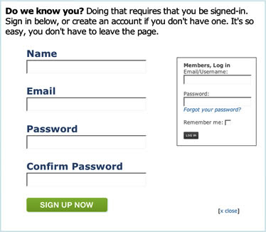
Form of the Week: Registration at Odeo.com

Props to Odeo.com for making our lives a little bit easier:

Odeo's Simple sign-up form

Monday, January 29, 2007

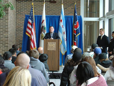
Mayor Daley at UIC

 Mayor Daley addressing group at UIC

Chicago's Mayor Daley came to speak at UIC today. While some of his talk seemed to ramble on and was, to be honest, less than inspiring, it was clear that Education is a big deal for him. He literally said it came after God and Family.

A funny moment came (at least for me) when he was talking about how even prison inmates needed vocational training and then as an aside, said something along the lines of:

"The unions used to be against it [work done by inmates] but that's when we made everything here. Now you've got things made in China so why not in our jails?"

I'm sure the mayor wasn't advocating prison labor and maybe China wasn't the best example to pick for comparison but it sure had me tittering in the back row.

Metrics of Success for Library 2.0?

When I read posts like this, I really have to ask myself what is the measure of success for incorporating new technology: the fact that it's been incorporated at all (nice) or that it's actually being used (even better).

"[S]ocial software, Weblogs, linklogs, folksonomies, wikis, podcasts, RSS feeds, and Web services" are definitely advances in the Web as we know it. I routinely use many if not all of these myself. But their simple inclusion (whether real or imaginary) into a library's website doesn't by itself constitute a "success".

It's important when trying to incorporate the tools of Web 2.0 that we don't forget the lessons of Web 1.0: you don't shove technology down the throats of your users simply because you've become enamored by it. Rather it's your users who define what your priorities are and whatever they want, you'd better be in a position to deliver on -- big time! That's the measure of success that counts.

Everything else is bupkis.

UPDATE: Apparently this has been on the minds of a couple of people. Have a look at Sarah Clark's "Dark Side of Library 2.0"

Sunday, January 28, 2007

Washington Post Issues Correction on Fairfax County Library Story

Washington Post Logo
The original story that appeared in the Washington Post about Fairfax County's weeding of classics from its collection raised a nationwide "firestorm of outrage".

Now WaPo Ombudsman, Deborah Howell, reports that the weeding wasn't perhaps as sweeping as orginally suggested:

The story said that "For Whom the Bell Tolls" and "To Kill a Mockingbird" are among the titles that hadn't been checked out in two years and that could be eliminated. Those books have been checked out; it would have been better to say that some copies of those books may not have been checked out in two years at some branches and could be weeded out. Kirkpatrick and Clay say there was never any intention of weeding out all copies.

Complete article here...

New ALA Wiki: Read Write Connect

ALA Logo

Bill Drew (SUNY Morrisville) posted a link on Web4Lib to the American Library Association's new Wiki, 'Read Write Connect'.

The Wiki brings together many of ALA's online services loosely defined as 'Web 2.0' (i.e. Podcasts, flickr, etc.) This is one of a series of new online products, the most successful of which, IMHO, is the electronic newsletter, AL Direct.

Friday, January 26, 2007

TECH cocktail 3 (Chicago)


I had a great time at TECH cocktail 3 last night. It was held at Amira in the NBC Building and the place was so packed at times that you could hardly squeeze in.

Sunday, January 21, 2007

Chicago Mapped Out in Flickr Tags

This is neat: Chicago mapped out in Flickr tags courtesy of the ZoneTag Project (Yahoo! Research).

Zoom in and move around and you'll see different tags show up. Click on the link, 'View on World Explorer', for a larger map and a photo browser. (h/t O'Reilly Radar)

Saturday, January 20, 2007

Link of the Day: Only Human

Only Human Website Screenshot

 Website 'Only Human' is the True Confessions of social networking sites.  It bills itself as a "community where people share stories about mistakes they've made in life and their advice to others."

A glance at some of the most recent 'mistakes' includes, "focusing on my studies and not getting a job", "getting in trouble with the cops" and "bringing along/almost finishing 2/3 a bottle of rum". Based on these experiences, authors can include one-line 'words of advice' that are then prominently displayed with special highlighting. Readers in their turn can leave comments and rate posts by clicking on a box marked "I learned from this".

Fun idea. Up there with Twitter. (h/t Mashable)

Tuesday, January 16, 2007

Drupal Turns 5

The popular CMS, Drupal has just announce the release of version 5.0. There are a number of enhancements particularly in administering the software. This site runs on Drupal so I guess I'll probably be upgrading soon.

Sunday, January 14, 2007

Meanwhile in France: The Ségosphère & Disco Sarko

The tools of Web 2.0 are available not only to Americans but to anyone on the planet fortunate enough to have a computer and access to the Internet.

In France, a country with 3.6 million "bloggeurs", the "presidentielles" are coming up in April and all the online manifestations of a political campaign that we became familiar with here during our own election in November -- the websites, blogs and videos -- are popping up in France as well.

SÉGOSPHERE

Socialist candidate Ségolène Royal not only has a campaign blog, SegoleneRoyal2007.net, but she's got a page on Blogspot, Ségo Blogs, telling people how to set up their own blogs in favor of her.

They've even got a videoclip of her greeting bloggers that ends with the stirring words, "Aux Claviers!":

DISCO SARKO

Conservative Nicolas Sarkozy has a more boring web presence at Avec-Sarkozy.fr (yuckie URL!) but some of his supporters made up for this by putting together the fun Flash site, Disco Sarko, which features the candidate dancing in various user-determined disco moves all to the beat of "Staying Alive" and "Shake Your Booty". Yes, even you can "fais groover Sarko sur le Dance Floor"!

Saturday, January 13, 2007

Follow Your Users (Because They Sure as Hell Aren't Going to Follow You)

MySpace Logo

Jon Alper, the Director of Technology at WGBH Interactive was asked at a conference by a j-school teacher (of all things) how to coax students away from MySpace.com and towards the school's own blog instead.

Alper's answer, as reported by Carleen Hawn from PaidContent, was essentially that posting on MySpace.com was bad because it abetted free content to the detriment of traditional (legitimate) content like newspapers and broadcast media.

It's hard to know where to start with such an approach. As Hawn herself points out, "...Isn't the idea of New New Media to leverage as many entities as possible?"

At a more basic level, the students are no dupes. They're simply following the crowd -- the market, the popular choice. Myspace.com is where they perceive their postings will have the widest and most significant audience.

And who's to argue with them? Instead of trying to rope them back in, the teacher should be working on how to get out there himself -- how to use their tools to his instructional advantage.

This stuff isn't rocket science.

Thursday, January 11, 2007

We Prefer the Barnum & Bailey School of Web Design

Greatest Show on Earth

 It's great to highlight the wonders of technology but we serve our users best if we first acknowledge what they're coming to us for.

Whatever that is -- and in the academic world, I'm assuming it's articles and books -- that's what we have to build our websites around. Indeed, the whole success of the operation depends on how well we deliver on these core functions.

Anything less and we've got a problem on our hands.

That's why I've got to wonder about all the talk of transforming our websites into social networks. Is this what our users, particularly in the academic world, are really coming to us for?

Are the ones coming to us for articles and books going to be satisfied if we throw a wiki at them?

Are they coming to participate in a "conversation" -- or do they just want to grab something quick and get the hell out?

We want to open up our data to the widest possible audience. We want to establish a presence, where appropriate, in every social network and widget that we can.

But simply because we want to use social networks and various other technologies to extend our footprint, doesn't mean that they're the only models to follow. In some cases, they may not even be the most appropriate.

-------------

Cultural Note to Extraterrestrials: Barnum & Bailey were famous for the adage, 'Always give them what they want'.

Wednesday, January 10, 2007

State Ethics Test Itself Raises Ethics Issues for Illinois Academics

If you work at a public college or university in Illinois you may already have heard of this. In fact, your Faculty Senate may be gearing up to lodge a complaint as we speak. There's also been articles about this in both the Chicago Tribune and Sun-times. [earlier version on archive.org]

Above is a copy of one of the letters the State Inspector General has been sending to a number of participants in last Fall's online State Ethics Test. The letter tells participants that their "certificate of completion" for having gotten the answers right is no longer valid because it took them less than 10 minutes to complete the test.

Now to a normal person, successfully completing a test, in this case on Ethics, in record time might indicate a special aptitude for the subject. However for the state of Illinois, this indicates instead an unwillingness to "meaningfully engage" with the material.

The "Noncompliant Employee" is then instructed to go though an included brochure, to sign the final page and send it back in -- under penalty of "disciplinary" action including being fired.

So naturally no one wants to be called "noncomplaint" particularly when it comes to ethics and many are refusing to sign the thing. The Tribune reports over 2300 offenders from U. of I. alone.

It would have been nice if they had mentioned the time requirement at some point during the test itself. Things aren't helped by the fact that Deputy Inspector General Gilbert Jimenez is going around "wondering" if people used a "cheat sheet" to finish up so quickly. Jimenez's statement to the Tribune implying that full-timers (i.e. people working "8 hours a day") had ample time to devote to the test is inaccurate if not altogether misleading since part-timers were required to participate as well.

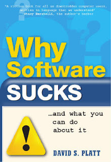
Podcast: David Platt on 'Why Software Sucks'

Book covert to book, 'Why Software SUCKS'

"It just works", repeats author David Platt almost as a mantra in this Podcast from IT Conversations. That's what software is supposed to do.

Users aren't interested in what goes on behind the scenes. All they want to do is accomplish their goals with the least amount of hassle.

An obstacle to this is software that's afraid to make assumptions -- even when doing so saves time (i.e. is valid) for the vast majority of users.

"Don't let edge cases complicate the mainstream", Platt pleads.

While the Podcast could use some editing (it goes on for over an hour) and while Platt's apparent familiarity with Microsoft products seems to narrow his perspective at times, still the thing is worth listening to.

Tuesday, January 09, 2007

Captcha of the Day

Hoo Baby! I caught a live one! No less than 10 characters long that you have to input perfectly in order to create an account at Myspace.com!

Fear of the spambot creating too many accounts? Is that the problem? Not that I'm complaining -- this one's worth it. Hello, 'mhhh5h7D7J', nice to meet you! (Though naturally I blew it on the first try.)

Saturday, January 06, 2007

Semi-Annual Message to ScienceDirect About Its Atrocious Registration System

Dear ScienceDirect,

This is my semi-annual message to you explaining how awful, frustrating and ultimately self-defeating your registration process is.

As I explained in my message from four years ago [see below], having your system automatically generate a user-name for someone as part of your registration process is a complete disaster. No one on the face of the planet is going to remember what your system has assigned to them.

There is no other website -- none -- that forces machine-generated user-names down the throats of its users. Just look around. The only reason I can imagine you have such a system is as a way to guarantee that the least amount of people actually use your service.

But don't believe me, just look at your own stats!

Sincerely,

Leo Klein
Chicago, IL

P.S. Making the machine-generated user-name case-sensitive(!!!) only adds insult to injury.

Thursday, January 04, 2007

The Usability of Logging In

Emre Sokullu writes about the "big barrier" of logging in to a site and what companies do to make things easier:

"Almost all the internet giants, like Yahoo, Google and MSN, use single sign-on across their properties to lower the threshold of accessing their services and to create a competitive advantage. The reason they do this is that signing up is actually a big barrier to entry for users of web apps. Users feel more comfortable when they don't have to sign up to use an app - it's much easier to give it a try and it's less time-consuming to start using it."

Great Interfaces Look Alike:

"Big Barrier" is right. Most sites keep records of people signing in. All you have to do is go through these records to get an idea of the difficulties people have remembering their personal information even with relatively "standard" login requirements.

STANDARD LOGIN

So what's 'standard'? Well, glad you asked. It's whatever everybody else is doing: email address or user name plus password.

The further you veer from 'standard', the more likely your user will have absolutely no idea how to access your site.

In libraryland this is something of a challenge since most of our systems work by a person's "library number". It's hard to emphasize how user-unfriendly this is -- how unlike any other authentication system the user is likely to encounter. The problem is only compounded by the fact that we're generally running multiple systems which in turn require multiple logins. No "single sign-on" here.

That's why the login on the Queens Borough Public Library Site is so fantastic: all you need is your username and password. Just like any site!

When developing systems, we need to work off of our users' strengths, building around things they're familiar with. Anything less should be a red flag.